AprilAire Content Strategy
Air You Can’t See, Benefits You Can Feel

How do you make highly technical HVAC products that live in your basement more relatable to people? You move past the mechanics and focus on how clean air actually impacts daily life. By transforming complex indoor air quality concepts into human-first stories, we built a serialized content strategy that positions AprilAire as a lifestyle leader.
The art direction leaned into the world around the product rather than the product itself. We wanted to make content that felt like it belonged in your feed rather than an ad trying to get your attention. Through this purposeful art direction and targeted content pillars, we turned a technical product into one of the top-performing social channels among its competitors.
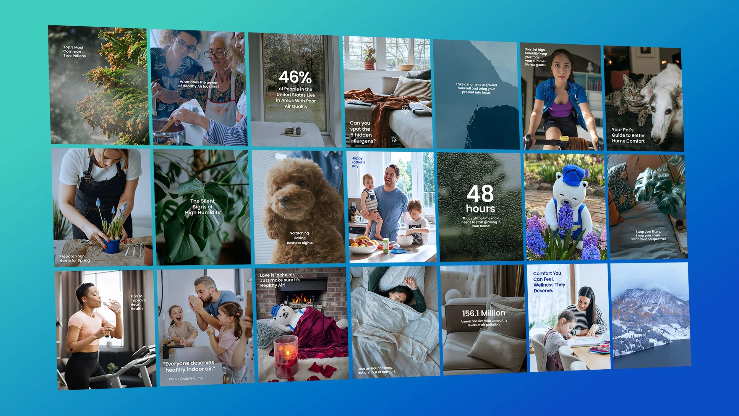
Infinite Variety. Singular Vibe.
True brand identity isn’t just about repetition. It’s about harmony. While many brands try to force unity by layering on extra design elements, we stripped away the noise to focus purely on the imagery. By locking in a simple, consistent typographic treatment and a deliberate color grade, we ensured that every distinct piece of content, from hard statistics to a friendly mascot, feels unmistakably part of the same world.

Breathe Better, Live Better
Clean air is more than a product feature. It is an essential foundation for a healthy lifestyle. This series connects AprilAire to the wellness rituals of exercise, meditation, and mindful living.
Pristine Air, From Nature to Your Home
Bringing the awe of the great outdoors into the living room. By visually comparing indoor air quality to the world's most pristine, natural landscapes, we emphasize absolute freshness and purity.
Quirks That Make a Home
A celebration of unfiltered, comfortable home life. These stories highlight the quirky, joyful, and whimsical moments of people fully living in their spaces, entirely free from worry.
Air Quality, Explained
Air quality can feel abstract until you see it in action. These short explainers brought AprilAire's products to life, showing people in a visual way exactly how they work and what they do for the air inside your home.
The Face of Healthy Air
Giving a technical brand a genuine heartbeat. By bringing AprilAire’s mascot, Merv, to life, we added personality, humor, and a memorable human touch that quickly became an audience favorite.